Case Study
DW Utility Consultants
Case Study
DW Utility Consultants
Transforming DW Utilities into a Modern and Recognisable Industry Player Through a Strategic Brand Refresh.
Location:
Nationwide
Industry:
Utility Management
Project objective:
To develop a recognisable and modern brand identity for DW Utilities that clearly communicates their USPs and stands out in the market.
Services Provided:
Logo Design, Graphic Design, Web Design & Development, Business Cards
Outcome:
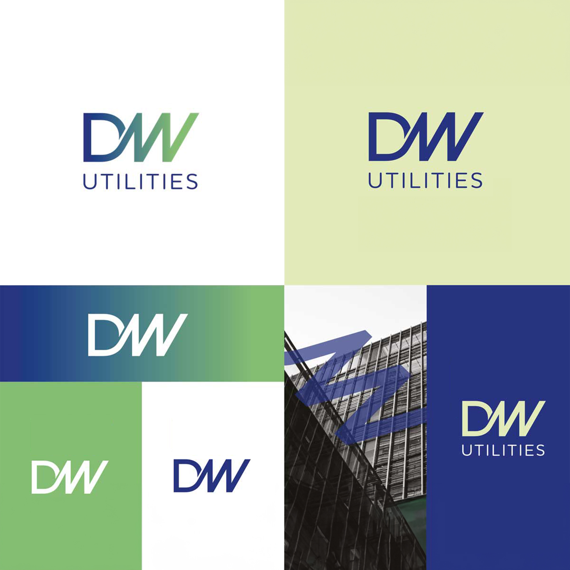
The refreshed DW Utilities brand now boasts a modern identity that effectively communicates the company’s key strengths. The chosen concept and design elements provide a cohesive and distinctive brand image, positioning DW Utilities as a dynamic player in the utility service sector.
Client Overview
DW Utilities, a utility service provider, approached us with the goal of revitalising their brand and establishing a modern identity that would distinguish them in a competitive market. The challenge lay in clarifying their unique selling points (USPs) and creating a brand that could stand out against industry giants.


Solving the problem
with clarity and creativity
Approach: We began by simplifying DW Utilities’ range of services into distinct and recognisable icons, addressing the ambiguity in their previous branding. Subsequently, we presented three initial concept routes for the new brand identity.
Concept 1: “Everything All Under One Roof”
- Focuses on DW Utilities as a turn-key solution provider.
- The logo incorporates a ‘roof’ element to reinforce the idea of a comprehensive service.
Concept 2: “Connecting You to the Right People”
- Emphasises the extensive network of contacts DW Utilities offers.
- The connected/linked logo symbolises the company’s commitment to connecting customers, and the gradient suggests quick progression.
Concept 3: “Taking Care of Things So You Don’t Have To”
- Highlights DW Utilities managing the process from start to finish, saving customers time, money, and resources.
- The logo features a hand as a strong device, and fresh, future-facing colours convey a modern and efficient approach.
Design Elements:
- The chosen colour palette is fresh and forward-thinking, symbolising progress and innovation.
- A colour gradient is utilised to represent the swift transition, mirroring DW Utilities’ commitment to getting customers to their new homes efficiently.
- The logo design itself signifies quick progression, with a sharp, direct “W.”
Brand Recognition:
- The entire logo is interconnected, emphasising DW Utilities’ role in connecting customers to high-quality suppliers promptly.
- The DW logo is versatile, serving not only as a standalone emblem but also as a device adaptable across various media platforms.


